

One super common UI gesture I see time and time again in apps is a 'popup' page or control. There's a few different options out there to do this with plugins / nugget packages (MAUI Community Toolkit, Mopups, Telerik, Syncfusion), however today I'd like to show you just one more way to achieve a simple popup using nothing but the controls and API's that come in the box with .NET MAUI.
ContentPage as a Popup
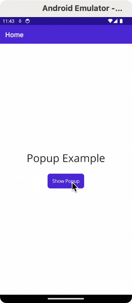
This concept uses a ContentPage from MAUI as the foundation of the popup itself. So let's start with a simple page (we're going to call it PopupPage):
<ContentPage
    xmlns="http://schemas.microsoft.com/dotnet/2021/maui"
    xmlns:x="http://schemas.microsoft.com/winfx/2009/xaml"
    x:Class="MauiCustomPopupPage.PopupPage">

</ContentPage>
Next we're going to add BackgroundColor="#aa000000" to the ContentPage itself. This is going to give us some translucency and create the illusion of the page appearing on top of the page/content below it.
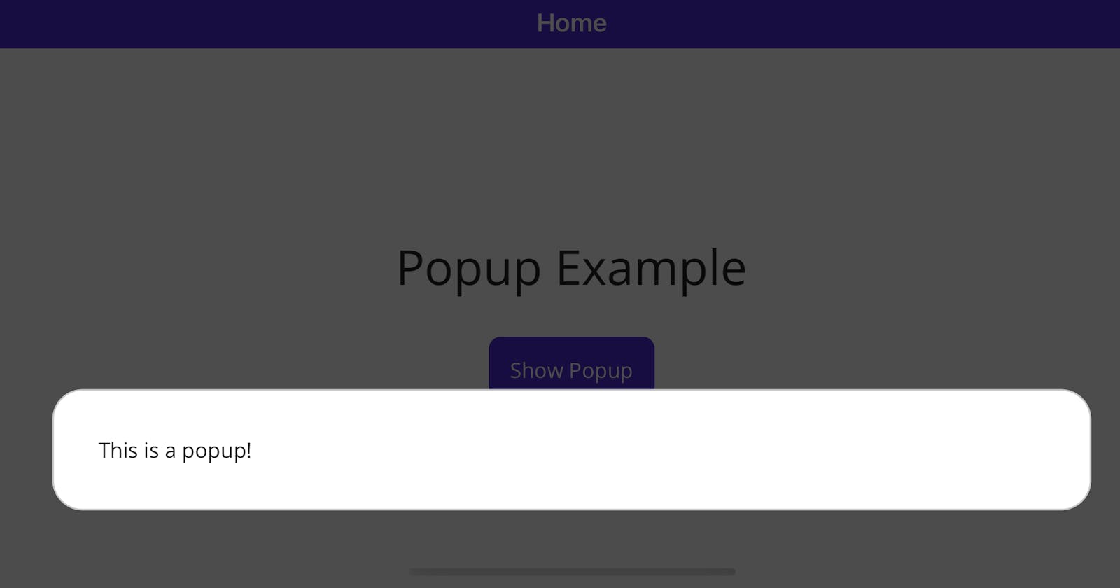
Inside the page content, let's add a Grid which contains a Border. The Border is going to be the backdrop for our actual content to display and give it a nice framed in area. I choose a border since we can easily give it some rounded corners to make it appear as a white box. Inside the Border we have a label, but you can add whatever you'd like here:
<?xml version="1.0" encoding="utf-8"?>
<ContentPage
    xmlns="http://schemas.microsoft.com/dotnet/2021/maui"
    xmlns:x="http://schemas.microsoft.com/winfx/2009/xaml"
    BackgroundColor="#aa000000"
    x:Class="MauiCustomPopupPage.PopupPage">
    <Grid>
        <Border
            VerticalOptions="End"
            Background="White"
            StrokeShape="{RoundRectangle CornerRadius=20}"
            Margin="30"
            Padding="30">
            <Label Text="This is a popup!" />
        </Border>
    </Grid>
</ContentPage>
Note that I've also given the border some margin to push it away from the edges of the screen a bit, some padding so the content isn't hugging the edges of the border, and set the vertical options to
Endso that the popup appears in the bottom of the screen.
This gives us a simple page we can navigate to and show some content on.
ModalPresentationStyle on iOS/MacCatalyst
Originally when I first wrote this code for my own app, I found that I needed to use the iOS platform specific ModalPresentationStyle set to OverFullScreen to display properly. It seems now that may be unnecessary. In any case, adding the code doesn't seem to be harmful, so you may want to add these attributes to the ContentPage tag in your popup page XAML to be safe:
xmlns:ios="clr-namespace:Microsoft.Maui.Controls.PlatformConfiguration.iOSSpecific;assembly=Microsoft.Maui.Controls"
ios:Page.ModalPresentationStyle="OverFullScreen"
Showing the Popup
Since this is a ContentPage, the way we will actually display the page is by navigating to it as a Modal page. On our main page, in our button click event, we can show the popup just by writing:
await Navigation.PushModalAsync(new PopupPage());
However, if you run this code now for iOS, you'll see it's not quite yet what we are hoping to achieve:
Custom Animation
Now, this is all starting to come together, but the translucent background seems to slide up from the bottom as part of the default Modal navigation animation. Also, this assumes we want to slide up from the bottom, but what if we wanted to slide in from the top or use some other entirely different animation?
We can fix this by first disabling the default animation in our PushModalAsync call by setting the animated: false parameter. Once we do this, we're on our own for doing any animation we'd like ourselves. Fortunately this isn't too hard to do in .NET MAUI.
Next, we're going to change the ContentPage's BackgroundColor="Transparent" that we originally had set to #aa000000. This is important since we will end up animating a fade in of that color instead of having it appearing at the start.
Next, we will write a method which uses the .NET MAUI Animation API's to achieve two things:
Fading the popup's background color from Transparent to a translucent black
Animating the translation of the content from below the screen, sliding into view
The code snippet below handles this animation for us:
public void PoppingIn()
{
    // Measure the actual content size
    var contentSize = this.Content.Measure(Window.Width, Window.Height, MeasureFlags.IncludeMargins);
    var contentHeight = contentSize.Request.Height;

    // Start by translating the content below / off screen
    this.Content.TranslationY = contentHeight;

    // Animate the translucent background, fading into view
    this.Animate("Background",
        callback: v => this.Background = new SolidColorBrush(Colors.Black.WithAlpha((float)v)),
        start: 0d,
        end: 0.7d,
        rate: 32,
        length: 350,
        easing: Easing.CubicOut,
        finished: (v, k) =>
            this.Background = new SolidColorBrush(Colors.Black.WithAlpha(0.7f)));

    // Also animate the content sliding up from below the screen
    this.Animate("Content",
        callback: v => this.Content.TranslationY = (int)(contentHeight - v),
        start: 0,
        end: contentHeight,
        length: 500,
        easing: Easing.CubicInOut,
        finished: (v, k) => this.Content.TranslationY = 0);
}
Now, we need a way to call this animation at the right time. What I found works well is to subscribe to the Loaded event in the popup page's constructor, and then invoke the PoppingIn method in that event (I also unsubscribe from the event when it's called since we only need to run that animation for this page once, and want to avoid causing any leaks):
public PopupPage()
{
    InitializeComponent();

    this.Loaded += Page_Loaded;
}

void Page_Loaded(object sender, EventArgs e)
{
    // We only need this to fire once, so clean things up!
    this.Loaded -= Page_Loaded;

    // Call the animation
    PoppingIn();
}
Now let's have a look at the result:
Closing the Popup
Finally, we'll want a way to close or navigate away from the popup. This is really just the inverse of what we've done so far. Here's the code for the animation to close the popup:
public Task PoppingOut()
{
    var done = new TaskCompletionSource();

    // Measure the content size so we know how much to translate
    var contentSize = this.Content.Measure(Window.Width, Window.Height, MeasureFlags.IncludeMargins);
    var windowHeight = contentSize.Request.Height;

    // Start fading out the background
    this.Animate("Background",
        callback: v => this.Background = new SolidColorBrush(Colors.Black.WithAlpha((float)v)),
        start: 0.7d,
        end: 0d,
        rate: 32,
        length: 350,
        easing: Easing.CubicIn,
        finished: (v, k) => this.Background = new SolidColorBrush(Colors.Black.WithAlpha(0.0f)));

    // Start sliding the content down below the bottom of the screen
    this.Animate("Content",
        callback: v => this.Content.TranslationY = (int)(windowHeight - v),
        start: windowHeight,
        end: 0,
        length: 500,
        easing: Easing.CubicInOut,
        finished: (v, k) =>
        {
            this.Content.TranslationY = windowHeight;
            // Important: Set our completion source to done!
            done.TrySetResult();
        });

    // We return the task so we can wait for the animation to finish
    return done.Task;
}
One notable difference here is that we return a Task in this one, which is based off a TaskCompletionSource that we set the result of only once the content animation is completed. This allows us to await the animation call while the page is closing so that the animation actually displays before the page is finally closed, otherwise we would not see the lovely animation.
To close the popup page, we use:
async Task Close()
{
    // Wait for the animation to complete
    await PoppingOut();
    // Navigate away without the default animation
    await Navigation.PopModalAsync(animated: false);
}
We can call this method anywhere we need to close it (perhaps after a user has clicked a close button), but one addition I like to use is a TapGestureRecognizer on the background Grid, so that if the user taps outside of the popup content area, it triggers the popup to close:
<Grid.GestureRecognizers>
    <TapGestureRecognizer Tapped="TapGestureRecognizer_OnTapped" />
</Grid.GestureRecognizers>
private async void TapGestureRecognizer_OnTapped(object sender, TappedEventArgs e)
{
    await Close();
}
Enjoying our work!
That's really about it! This works on iOS, Android, Windows, and MacCatalyst .NET MAUI apps now. We easily created a Popup Page that can be customized however we'd like. If you want to experiment with changing up the animations, placement of the content, or whatever, you now have the knowledge and tools you need!
Here's some more images of things running nicely:
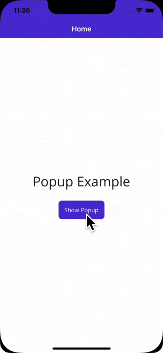
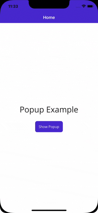
iOS:

Android: